Wednesday, 19 May 2010

Poster & Flyer Design:

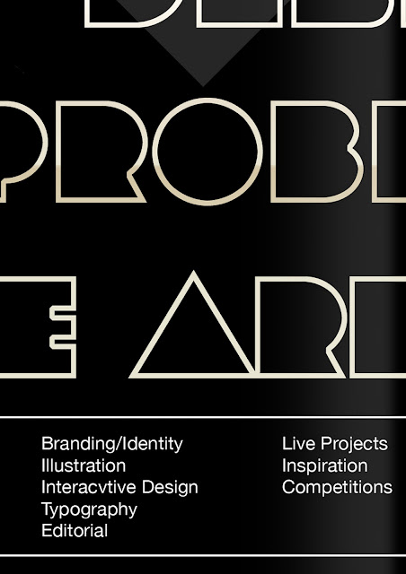
The following posters were made to advertise Envy. The ideas was to create a series of posters that were based on principals of design, that were taylor made for Envy. The posters are strictly typographic with heavy use of design aesthetics to guide the audiences eyes across the page. The principals are also explained on the poster through strategically placed typography. These poster will be printed out at A2 size on 300gsm glossy paper.


Flyer Design:
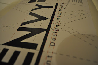
These flyers were design with the other printed matter in mind. Notice the use of the watermark 'E' beneath the design. For the flyers content was much more important that any thing else so the highest possible contrast of color have been used as well as the golden section to aid the composition. These flyers will be printed out at A6 size on 200gsm paper.


Wednesday, 12 May 2010

Web Design: 1


Motion Graphics: 1


I began my research for the motion graphics work outlining what I planed to do and achieve by the end of the project. It starts by looking at some television spots such as the work done for the MTV: genetically engineered spots by a company called Umeric. I also looked at a stereoscopic 3d animation called Broken by Stephan Voight.


I reased motion graphic in design journals such as computer arts and founds tonnes of tips and advice that I would adhere to over the project to ensure the production pipeline stayed as a smooth as possible over its development; from organising of files to securing URL names and design processes.


I made a rough storyboard for an idea I had for a motion graphics ideate for the company logo I had just completed. I knew what I wanted to doubt I was unsure as how to create it. I knew it would require some use of After Effects and its 3D camera tools. I would have liked to use 3D text but I do not have the resources such as 3D programmes to create it, so i will have to rely on some design trickery to present the illusion of depth and form. The logo needs to have a presence and the indent needs to feel almost movie worthy.


I took screenshots of the design process and annotated so that it is easier to understand it in my sketchbook work. I have also screenshot and annotated the final animation. From this I will begin to develop an advertisement that includes the services and acts as an advertisement fro the company to drive traffic to the website. The motion graphics logo captures the essence of Envy and I am excited about its possibilities to be developed further.

Print Finals 2

put in photographs of actual prints.

Print Finals


Sunday, 2 May 2010

Final Major Project 3.4: Ideas


"I learnt a lot of skills and techniques and that it takes a team of people to organise such a large campaign a task which I had undertaken by myself."

I gathered information from Computer Arts Magazine about cross media campaigns. The information consisted of industry professionals from preparation and 'CMYK' vs 'RGB' to print finishes and consistency. I annotated next to their comments about what I needed to based on what they said so knew what needed to take care of first and perorations that needed to be made. Along with this I learnt a lot of skills and techniques and that it takes a team of people to organise such a large campaign a task which I had undertaken by myself.

Sunday, 25 April 2010

Final Major Project 3.3: Ideas


"A logo does not need to tell the consumer what the company is about... for this to work the logo needed to have that information within it."


Once the info-graphics were complete I went back o edit the logo based on the criticism. I came to the conclusion that, dispute the fact that logos do not need to tell consumers what the company is about, for this to work the logo needed to have that information within it. I decided to add some text to the logo that told consumers what we did "Print. Design & New Media". However i then had to decide what font to use for this text and went through several basic fonts including but not limited to; Garamond, Veranda, Times, and Helvetica I eventually settled on Myriad Pro as it had perfectly conveyed what the company was about in terms of style.


"It is important to test the effect of colour in a logo and consider it effects on consumers"


Once the words and typeface had been decided I used Adobe Illustrator to make final adjustments to the logo. One the positioning of the text had been finalised I decided to settle on an underline beneath the worked 'ENVY' as it gave the logo something to work with. I made the finalised logo and experimented with the overlaid coloured versions of the text (below). Because we are aware the logo works in black and white it is important to test the colour and the effect of the colour on the consumers.