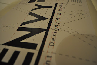
"A logo does not need to tell the consumer what the company is about... for this to work the logo needed to have that information within it."
Once the info-graphics were complete I went back o edit the logo based on the criticism. I came to the conclusion that, dispute the fact that logos do not need to tell consumers what the company is about, for this to work the logo needed to have that information within it. I decided to add some text to the logo that told consumers what we did "Print. Design & New Media". However i then had to decide what font to use for this text and went through several basic fonts including but not limited to; Garamond, Veranda, Times, and Helvetica I eventually settled on Myriad Pro as it had perfectly conveyed what the company was about in terms of style.

"It is important to test the effect of colour in a logo and consider it effects on consumers"
Once the words and typeface had been decided I used Adobe Illustrator to make final adjustments to the logo. One the positioning of the text had been finalised I decided to settle on an underline beneath the worked 'ENVY' as it gave the logo something to work with. I made the finalised logo and experimented with the overlaid coloured versions of the text (below). Because we are aware the logo works in black and white it is important to test the colour and the effect of the colour on the consumers.


No comments:
Post a Comment